1)Flex
- flex-direction: row /column (주 축설정)
- row >>>

- column >>>

- nowrap: 기본값
- wrap: 줄바꿈
- nowrap>>

- wrap>>

- justify-content: 메인축 방향으로 정렬 (주축 기준)
- align-item (justify 이후에 설명있음): justify-content와 수직 방향의 정렬이라고 생각(교차축 기준 )


- flex-start (기본값)
아이템들을 시작점으로 정렬.
flex-direction이 row(가로 배치)일 때는 왼쪽이 기준, column(세로 배치)일 때는 위를 기준.
- flex-end
아이템들을 끝점으로 정렬.
flex-direction이 row(가로 배치)일 때는 오른쪽이 기준, column(세로 배치)일 때는 아래가 기준. - center
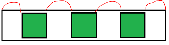
아이템들을 가운데로 정렬. - space-between
아이템들의 “사이(between)”에 균일한 간격을 만들어 줌.
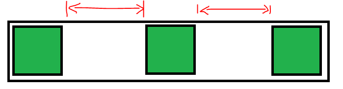
- space-around
아이템들의 “둘레(around)”에 균일한 간격을 만들어 줌.
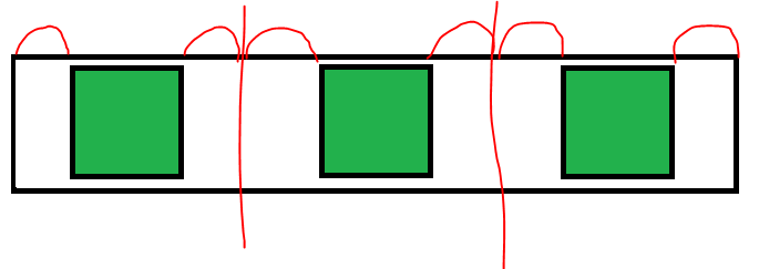
- space-evenly
아이템들의 사이와 양 끝에 균일한 간격을 만들어 줌.
주의! 엣지(Edge)에서는 지원x
- align-item : justify-content와 수직 방향의 정렬이라고 생각(교차축 기준)
- stretch (기본값)
아이템들이 수직축 방향으로 끝까지 쭈욱 늘어남. - flex-start
아이템들을 시작점으로 정렬합니다.
flex-direction이 row(가로 배치)일 때는 위, column(세로 배치)일 때는 왼쪽. - flex-end
아이템들을 끝으로 정렬합니다.
flex-direction이 row(가로 배치)일 때는 아래, column(세로 배치)일 때는 오른쪽. - center
아이템들을 가운데로 정렬함. - baseline
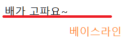
아이템들을 텍스트 베이스라인 기준으로 정렬함.
<!DOCTYPE html>
<html lang="en">

<head>
    <meta charset="UTF-8">
    <meta http-equiv="X-UA-Compatible" content="IE=edge">
    <meta name="viewport" content="width=device-width, initial-scale=1.0">
    <title>Flex</title>
    <style>
        * {
            margin: 0;
            padding: 0;
            box-sizing: border-box;
        }

        .container {
            width: 600px;
            height: 600px;
            background-color: darkgrey;
            display: flex;
            flex-wrap: wrap;

            flex-direction: column;
            justify-content: space-around;
            align-items: center;
        }

        .item {
            border: 1px solid black;
            background-color: green;
            width: 100px;
            height: 100px;
        }

        .item:nth-child(even) {
            background-color: aqua;
            /* align-self: flex-start; */
        }
    </style>
</head>

<body>
    <div id="wrap">
        <div class="container">
            <div class="item">item1</div>
            <div class="item">item2</div>
            <div class="item">item3</div>
            <div class="item">item4</div>

        </div>
    </div>
</body>

</html>'Html > 이론' 카테고리의 다른 글
| 반응형 웹 (0) | 2023.05.26 |
|---|---|
| grid (0) | 2023.05.24 |
| background/position/ (0) | 2023.05.23 |
| 대소문자/ 들여쓰기/선으로 텍스트꾸미기/ 글자 단어 사이간격/border (0) | 2023.05.22 |
| :active/:hover/:visited/ nth-child (0) | 2023.05.22 |


